Color Like Kandinsky: How Famous Artists Used Color Psychology (and How You Can Too!)
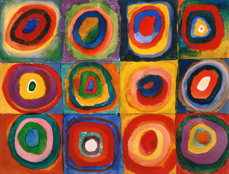
Kandinsky believed that colors weren’t just visual, they carried emotional and even spiritual meaning. To him, yellow was playful and lively, blue was deep and spiritual, and red was powerful and restless. He thought of color almost like music, with each shade hitting a different emotional note.
Of course, Kandinsky wasn’t the only artist to use color psychology:
Van Gogh used vibrant yellows to capture warmth and optimism in works like Sunflowers.
Pablo Picasso famously went through a “Blue Period,” using shades of blue to express melancholy and introspection.
Mark Rothko created large fields of color meant to stir deep emotional responses, from serenity to awe.
So how can you use color psychology in your own art? At Pinot’s Palette, our classes make it easy to experiment. Want to create something peaceful? Reach for cool shades like green and blue. Looking for energy and excitement? Try oranges, reds, and bold yellows. You don’t have to be a famous artist to make colors work for you, all it takes is a brush, a canvas, and a willingness to play.
The next time you join us at Pinot’s Palette, think about how your favorite colors make you feel. Just like Kandinsky, you can use color to express your personality, mood, or even create the perfect piece of décor for your home. After all, painting isn’t just about what you see, it’s about what you feel.
About The Painting, Above:
'Color Study. Squares with Concentric Circles'
1913
Wassily Kandinsky
https://www..../work-370.php