

The Magic of Mixing Colors: How Artists Create the Perfect Shade
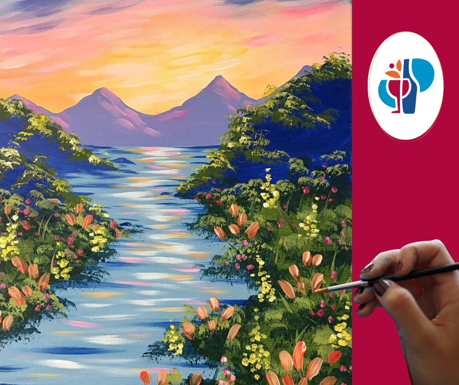
Color is one of the most exciting parts of painting. It sets the mood, adds depth, and brings a scene to life. And while mixing colors might seem tricky at first, you don't have to be an experienced artist to learn the basics.
At Pinot's Palette Naperville, we love seeing what happens when people start experimenting with color. Let's take a look at how it all works!
It All Starts With the Color Wheel
Remember learning about the color wheel in elementary school? It's still one of the most useful tools for artists!
In traditional painting, the three primary colors are red, yellow, and blue. Mixing two of these creates a secondary color:
Red + Yellow = Orange
Blue + Yellow = Green
Red + Blue = Purple
Mix a primary color with a neighboring secondary color, and you get a tertiary color, like blue-green or red-orange.
Of course, actual paint doesn't always mix quite as neatly as the color wheel suggests. That's part of the fun of experimenting!
Warm Colors, Cool Colors, and Everything in Between
Colors do more than make a painting pretty. They help create a certain feeling.
Warm colors, like reds, oranges, and yellows, remind us of sunshine, autumn leaves, and cozy fireplaces. They can make a painting feel cheerful and inviting.
Cool colors, like blues, greens, and purples, often feel calm and peaceful, like a quiet lake or a snowy landscape.
Artists often use both to create contrast. Think of a glowing orange sunset against a deep blue sky!
How Do You Make a Color Lighter or Darker?
Sometimes the color straight from the paint bottle isn't quite right. Luckily, a little mixing can change that.
Adding white creates a lighter color called a tint. Red becomes pink, and blue can become a soft sky blue.
Adding black creates a darker color called a shade. But here's a little trick: adding a tiny amount of a color's opposite on the color wheel can sometimes create a richer, more natural-looking dark color.
The best advice? Add paint gradually. A little can go a long way!
Why Do Certain Colors Look So Good Together?
Ever notice how some color combinations just seem to work? The color wheel can help explain why.
Complementary colors sit opposite each other, like blue and orange or red and green. They create contrast and make a painting pop.
Analogous colors sit next to each other, like blue, blue-green, and green. These combinations feel softer and more balanced.
Neither is right or wrong. It simply depends on the look you're going for!
There's No Such Thing as Just One Perfect Color
One of the best things about painting is that everyone sees color a little differently.
One person might paint a sunset with bright pinks and oranges, while another prefers softer peaches and purples. Both can look beautiful!
We see this all the time at Pinot's Palette Naperville. Even when everyone follows the same painting, no two finished canvases look exactly alike.
And that's the beauty of art. It's not always about matching a color perfectly. It's about creating something that feels right to you.
Come Mix Up Some Creativity at Pinot's Palette Naperville!
The best way to learn about color is to play around with it! You might be surprised by how many shades you can create with just a few basic paints.
At Pinot's Palette Naperville, our instructors guide you through the painting process step by step, from mixing colors and blending backgrounds to adding the finishing touches. No experience is needed, and there's always room to add your own creative spin.
Whether you're planning a date night, getting together with friends, or just looking for something fun to do in Naperville, we'd love to have you join us.
Check out our upcoming painting classes at Pinot's Palette Naperville and discover a little color magic for yourself!